Sunday, February 18, 2024

Navigating the World of Social Media Influencers

In this rapidly evolving digital media world, the rise of social media influencers has revolutionized marketing strategies and consumer behavior. A recent episode of CBS News' 60 Minutes, titled "The Influencers" offered an in-depth exploration of this phenomenon. The segment provided an extensive overview of the influencer landscape and their substantial influence, featuring key insights from prominent figures such as Logan Paul, Zach King, Amanda Cerny, and Andrew Bachelor.

A significant lesson from the episode was the immense influence employed by social media influencers. These individuals, skilled with technology, have amassed vast followings on platforms like Facebook, Twitter, and Snapchat. For instance, Logan Paul alone has over 30 million followers across various platforms, competing the audience reach of major films and television shows.

What distinguishes influencers is their capacity to engage and establish personal connections with their audience. Through authentic and relatable content, they have cultivated dedicated followings that place trust in their recommendations and viewpoints. This level of trust makes influencers invaluable assets for brands seeking to target specific demographics and foster consumer engagement.

In terms of marketing tactics, influencers leverage their personal brand and creativity to produce compelling content that resonates with their audience. They utilize a variety of approaches, including humor, magic, or lifestyle-oriented content, to attract the interest of their followers and seamlessly integrate branded material into their content channels.

From the consumer's perspective, influencer marketing blurs the boundaries between advertising and entertainment. Instead of inactively receiving marketing messages, consumers actively search for and interact with influencer content, establishing authentic bonds with their preferred personalities.

 References:

Whitaker, B. (2016, October 23). The Influencers. CBS News. https://www.cbsnews.com/news/60-minutes-kim-kardashian-logan-paul-social-media-influencers/


Sunday, February 4, 2024

Crafting Connections with Whirlpool's 'Every day, care' Campaign

Shifting Perception

Whirlpool listened to its consumers’ needs through research and realized that consumers found home chores with appliances to be thankless, repetitive, and unfulfilling. However, the studies revealed that these mundane chores held a significant value for both families and society at large. Whirlpool set its goals on changing this negative perception by emphasizing the meaningful impact of everyday care and household chores on the well-being of families and their contribution to society. This shift in perspective formed the basis of Whirlpool's "Every day, care" campaign, focusing on portraying chores as acts of love with the power to make a positive difference. 
In order to achieve its goal, Whirlpool dedicated itself to discovering numerous real-life narratives centered around 'Every day, care' directly from genuine consumers. The campaign, which stands as the brand's most extensive one to date, greatly depended on word-of-mouth promotion to establish an essential groundwork for its comprehensive strategy. The brand’s use of authentic storytelling encompassed Everyday, care campaign which leveraged Crowdtap to build a community of 17K advocates who shared authentic stories through text, images, and videos in social media platforms (#EveryDayCare). From this, more than 44K pieces of user-generated content (UGC) were collected, forming a rich informational web of real experiences. This campaign became a rousing success as the brand built emotional connections with its audience. Whirlpool connected with consumers emotionally and strengthened trust with its consumers, which in turn transcended the notion of a mere transactional connection with its consumers. As a result of the campaign, there was a 12% increase in unit growth and a 6.6% rise in sales compared to the previous year, outperforming industry standards (#EveryDayCare). Whirlpool helped its consumers realize that their consumers are heroes of their own daily routines. That use of house appliances is in effect contributing to the betterment of family and society.

Social and Consumer Experience

Whirlpool's strategy for social and consumer engagement played an important role in the campaign's success. They accomplished this by first focusing on transforming the social and consumer experience by shifting the brand-consumer conversation from product-centric to emotional, ultimately aiming to engage consumers beyond the point of product complaints and make them feel like they are part of a larger conversation and experience. The strategy and execution of the campaign incorporated various elements to enhance the social and consumer experiences. Whirlpool established a dedicated microsite (whirlpool.com/everydaycare) to serve as a central library for real stories, creating a platform that encouraged visitors to actively contribute to the conversation (#EveryDayCare). The microsite featured a curated grid of user-generated content (UGC), showcasing the diversity of consumer experiences and perspectives (#EveryDayCare). The campaign’s success can be attributed in part to this curated site as the microsite acted as an engaging space, fostering interaction and participation in the campaign. Whirlpool also executed a comprehensive paid, earned, and owned media strategy that spanned various channels, including new broadcast media, digital media, and social promotion which resulted in “inspiring a broader wave of consumers to get in on the conversation” (#EveryDayCare).

Handling Digital Media Followers

Whirlpool effectively managed the social and consumer experience by strategically handling its digital media followers. Utilizing Crowdtap, the company built a community of 17,000 passionate advocates who openly shared their sincere "Every day, care" stories using diverse mediums such as text, images, and videos. This method not only produced authentic and relatable content but also led to a surge of genuine stories across earned, owned, and paid channels, establishing a solid foundation of authenticity for the entire campaign. With the curation of over 44,000 pieces of user-generated content (UGC), Whirlpool presented a varied collection of consumer experiences and perspectives. The brand's focus on cross-promoting the finest UGC across different channels, including social media and television spots, ensured active engagement from digital media followers. This user-centric approach effectively transformed followers into contributors, fostering a dynamic and captivating brand narrative. Whirlpool's paid, earned, and owned media strategy, combined with an amplification approach, successfully exposed digital media followers to a diverse range of content, integrating them as essential participants in the storytelling process.

Opportunities for Efficiency Improvement


To boost the campaign's effectiveness, Whirlpool might consider integrating more interactive elements into the microsite, serving as the central hub for stories. For instance, incorporating features like forums or live chats could offer digital media followers opportunities for active engagement with both each other and the brand, nurturing a more dynamic and engaging experience. They can also establish a schedule for regular events or updates that would guarantee digital media followers to stay consistently engaged, promoting an ongoing and interactive dialogue between the brand and its audience.

Effective Strategies Still in Effect

According to Julia Cannon from Digiday, Whirlpool is effectively utilizing influencers to enhance awareness of its Care Counts Laundry Program (Cannon, 2023). This program, which is running for close to ten years, seeks to influence communities throughout the United States by providing washers and dryers to schools that do not have access to these facilities (Cannon, 2023). The brand strategically partners with influencers deeply invested in the subject matter. Leveraging these trustworthy influencers, Whirlpool aims to authentically communicate the positive outcomes of the Care Counts initiative, reaffirming its commitment to making a positive impact in communities. According to Julia Cannon, the chosen influencers for the campaign have a history of engaging with communities and participating in public speaking events, aligning with the brand's goal of supporting the development of children (Cannon, 2023). Whirlpool's approach is audience-centric, selecting influencers whose followers demonstrate an interest in educational topics.

Ethical engagements in social media play a central role in Whirlpool's effectiveness. The brand's collaboration with influencers is rooted in authenticity, aiming to establish genuine connections with students, parents, and individuals interested in their products at a personal, human level. By having influencers share the story and impact of the Care Counts initiative, Whirlpool engages in ethical and transparent communication (Cannon, 2023). The focus on influencers who are deeply invested in the subject matter contributes to the credibility of the campaign, building trust among the audience. This ethical engagement fosters a positive brand image and resonates with socially conscious consumers.

References:

#EveryDayCare – whirlpool, DigitasLBi and Crowdtap. The Shorty Awards. (n.d.). https://shortyawards.com/8th/everydaycare-whirlpool-digitaslbi-and-crowdtap-2

Cannon, J. (2023, November 14). Why whirlpool is tapping influencers to boost awareness of its in-school laundry program. Digiday. https://digiday.com/marketing/why-whirlpool-is-tapping-influencers-to-boost-awareness-of-its-in-school-laundry-program/#:~:text=Whirlpool%20is%20enlisting%20the%20support,to%20schools%20lacking%20these%20facilities.

Sunday, January 14, 2024

A Typical Day Surfing Net Turf for Digital Doubloons

In today's digital age, a significant portion of my daily life revolves around various online platforms and applications. From staying informed with the latest news to finding inspiration for creative endeavors, digital media plays a central role in my routine. I invite you to navigate a typical day, exploring the sites and applications I frequent, my reactions to different forms of digital media, and how these platforms cater to my needs.

Most Visited Sites and Apps

Three of my most visited sites and apps are google search engine, YouTube and Spotify. I normally use the news feed of google for my quota of daily news. I use Spotify for music and audiobooks. I usually start my day by listening to my favorite music and end the day listening to audiobooks. Sometimes I am inspired by the newsfeed of google, YouTube feed and my playlist of Spotify. I become inspired to create designs, poetry and stories.

Reactions to Digital Media

Mostly, I have positive reactions when I use digital media. However, when I am interrupted by unnecessary information in the middle of my focused searches, I become irritated by such distractors.

Digital Media Satisfies Needs
Most of the time, I use either the google search engine or YouTube. I find the content generated by both to be informative and helpful. Whenever there are tasks, I am completely ignorant of, I find helpful information in YouTube on how to tackle such tasks. For instance, recently I was stymied on how to properly clean the grout of my titles for them to look brand new. Naturally, I googled “how to clean the grout of my tiles without harmful chemicals,” and I found a clear solution to my query—which worked! I normally, always find my needs to be met in the digital media I use. It is rather difficult to recall an instance when the digital media has failed me. That being said, don’t fail me now DM!

Email Interactions 
I receive emails from multiple companies, most of which I file in my spam folder. However, there are those that pique my interest. Emails which contain interesting topics, products and information normally catch my attention. Topics that are brief and yet interesting; products that will facilitate and enhance my life or the lives of my loved ones are some of the reasons I pay attention to such emails. There are some emails that contain information which is pertinent to my pet cat. I always keep an eye out for such information as I want to facilitate for my pet to have a healthy, happy and long life.

Observations on DM in Marketing
Today’s use of digital media marketing is tailored to individual preferences. For instance, my YouTube feed is very different to my friends’ and family members’ feeds. They all differ in terms of individual interests. I personally think that this feature has both positive and negative outcomes. It is positive in terms of product and service positioning that enable the consumer to consume, invest or purchase products that will enhance their lives. For instance, if a person is interested in healthy weight loss and searches of ways to accomplish their goals using search engines such as google or YouTube, their recommended feed would expose them to variety of weight loss products, services and affiliates of those as well. However, I also believe that such tailored feeds also limit a person from exploring information to which that person is not exposed or has no notion, thereby, limiting that person’s knowledge of the world events which might be crucial. Also, sometimes, even before I know what I am looking for, I get recommended information which makes me feel eerie because it makes me feel like the digital platform I am using know more about me than I would care for it to know. I view this as a violation of privacy.
 

As I navigate through the digital landscape each day, the sites and applications I visit become not just tools but important parts of my routine. Positive interactions shape my creativity, while occasional annoyances remind me of the ever-evolving nature of these platforms. From tailored marketing to personalized emails, the digital realm caters to individual preferences, offering both convenience and, at times, raising concerns about privacy. In this interconnected world, my experiences with digital media continue to shape and enhance different aspects of my life, creating a dynamic and evolving relationship that mirrors the constant evolution of technology.

Wednesday, December 5, 2012

Week 13 - Music Video Comment


Hello Class, 
as discussed previously with Julia, I'm going to base this assignment on a video different from the one you discussed, since I wasn't able to see the Yellow Submarine video due to German copyright restrictions. 

I must admit it wasn't as easy to find a video to discuss once agin due to the copyright laws and also due to the lack of imagination and artistical composition of the videos nowadays. Finally I chose to discuss the music video of "You are a Tourist" from Death Cab for Cutie. I think this video could have had a lot of creative potential because of their usage of light reflections and geometrical figures. Sadly I think the color blocks and the more filigree lights used in the video don't really match. For example I love the bird perspective of the floor in minute 2:40 in which they showcase a city filled with different options while showing circles in complementary contrasting colors over a crossroad. Also minute 3:33 is amazing with all the more muted colors contrast so well with the highly saturated green of the moving windows. But the contrast from minute 3:33 to 3:36 is just too much, although one might argue that the difference of the geometrical forms to the more filigree ones could be seen as a contrasting complement, I think both of them tell a different kind of story. In my opinion if they would have used only the color blocking/geometrical idea the video would had been much better. All the room's, ballerinas and led lights on the musicians are just distracting elements which are not really necessary. I would love to know what you think about it. Here is the link where you can see the video: http://vimeo.com/24569549


Geometrical


Filigree

Thursday, November 29, 2012

Yellow Submarine Yellow Submarine

Oh the good old Beatles. My Dad and his brother are both huge fans, as would be pretty much anyone of that generation? Of course not that they don't have a legacy to be enjoyed by many generations after them, but that was certainly the hey day. I visited a few Beatles spots when I went to London, but I've never been a huge source of knowledge on the subject. On their use of color, I really like the music video. And I really appreciate the art behind it, much more than so many music videos today. Even though the Beatles may have been singing about some unsavory topics (someone brought up Lucy in the Sky with Diamonds), I think at least that the video isn't too in your face with unsavory topics. To clarify, I think that music videos nowadays are taking the "sex sells" idea and just shoving it our faces. Just because it sells, doesn't mean it's the only way to sell. I think the Yellow Submarine video is fun and colorful and makes you feel very whimsical, I was tempted to dance around a little bit. It's all sort of silly, and I like it.

Wednesday, November 28, 2012

Yellow Submarine

I had no idea this movie was inexistence until having to view it for this class. I am so glad though that I now know this movie exists, I wish I could have watched it with my brother. He was a huge Beatles fan. He would have loved the music, I however am more a fan of all the bright colors. The use of color almost makes me feel like I can feel the music tactilely. That may sound funny, but it gives the music another dimension that only well directed and produced music videos can.
For some reason all the crazy colors remind me of an Andy Warhol exhibit I saw at the Denver Art Museum. He was like the king of Pop Art which uses bright colors and certainly isn't subtle and neither is this movie. All the colors with different shapes and dinosaurs and machines eating people gives life to the musical art. I don't know if I would recommend this movie for my nephews and niece today, but surely am disappointed I wasn't able to share the imagery gold with my brother.

Tuesday, November 27, 2012

Yellow Submarine


Strongly saturated, often complimentary colors were regularly used with occasional achromatic palettes in the background to make the colors stand out even more. There was an obvious difference in the colors and graphics used to match the mood of the songs; obvious to the point of being predictable.  So with an upbeat song the fish were a cacophony of colors with fins beating at a frantic pace. With Eleanor Rigby and all the lonely people the visuals were much more simplistic and neutral or achromatic. In between was ‘When I’m 64’, with images that were again simplistic to match the slower beat, but since the song is actually goofy the graphics were again colorful. Just imagine how much more interesting it would have been to have the frantic fish exploding in color to the tune of Eleanor Rigby.  And therein lies the rub. 

yellow submarine

I have always been a fan of The Beatles and Yellow Submarine is one of my favorite albums.  I remember watching the movie when I was a kid and thinking it was the strangest thing I had ever seen.  I still find it an odd movie watching it now.

I never noticed the rythmic movement of the animation before today.  Don't get me wrong, I intuitively understood the idea of stop/limited animation the film used to create the moving image, but I didn't realize how well synced it was to the score.  Not just The Beatles album tracks but the incidental music that helped move the story along.

As for color.  Yes, I think we are all going to agree that there are plenty of saturated, vivid hues in this film that add to the psychadelic look of the 1960s film. But what I found interesting was the contrast between the BLUE MEANIES and the YELLOW SUBMARINE.  Very striking contrast (bordering on a complimentary contrast of BV-YO.)  Love that.

I also, really appreciated the contrast of vivid saturates hues to the muted tones and tints.  The tones and tints were usually used in more somber unhappy moments and the vivid pure hues were used in happier joyous moments/characters.

My thoughts on the Yellow Submarine


The “Yellow Submarine” is a very colorful and graphic animation movie. It is highly reflective of the organic shapes, clashing colors and almost hypnotizing contrasts in the 70s. The following are some of the way color was used in a powerful way to compliment the music and the narrative of the story:

  • In the opening scene, Pepperland was a harmonious and happy place. The scene had an organic and hand-drawn illustration quality, and was composed of whimsical objects, floral and foliage in backgrounds, and vibrant warm colors of greens, yellows and reds. All these elements suggested of harmony and nature. A cheerful classic music was playing in the background.
  • In the scene where the villains “the Blue Meanies” appeared, the backdrop has been changes to a bleak monochromatic white and grey scheme, with the villains colored in contrasting deep blue. The cool and harsh color scheme is strikingly different from the previous scene. The music also changed from harmonious to dramatic and sharp. As the Blue Meanies attacked the people of Pepperland, and all victims that were frozen and turn into black and white statues, further emphasizing the contrast between the two worlds.
  • In the scene of “All the Loney People”, we see a backdrop of the grey cityscape of London, and this time, the graphic is more photo-like and realistic, giving us a sense of seriousness and reality compared to the organic hand-drawn illustrations before. This of course corresponded with the seriousness of the music and lyrics of the song. With this backdrop, the bright yellow of the submarine really stood out, creating a strong focal point.
  • At the large whimsical mansion where the members of the Beatles were living, it is interesting to see the different theme, music and colors in the different rooms. For example, the India room has a warm, deep violet color scheme, and had Indian music as the background music. The interior hallways of the mansion also had neutral colors and simple design, creating a contrast to the rooms, which were overfilling with whimsical and colorful characters and objects.
  • In the Yellow Submarine” underwater “scene, the graphic was very vibrant and energetic, very much like the beat and the pulse of the song. The fishes had contrasting colorful patterns, which flashed in tune with the beat of the song. The contrasting stripe patterns on the sea rocks also added to the busy and mesmerizing scene.

Metamerism examples in interior design

One example of metamerism I have personally encountered is the impact of lighting on wall paint color. I am sure many of you have picked a wall paint color in a store based on the samples, and when you actually paint your wall at home, the color appears warmer.

This is due to the different light sources used in the store and at home. Fluorescent lighting is usually used at the hardware stores, causing the color samples to have a cooler tint. On the other hand, the lighting we have at home is usually sunlight or incandescent lights, so the paint color will look warmer.


Another example of metamerism is the effect of finishing/texture on color. On glossy or polished surface, more light is reflected, creating the illusion of a cooler color. I have tried to apply a semi-glossy paint to a wall in a neutral muted grey color, and due to the reflective finish of the paint, the color actually appeared to be violet during daylight.


Tuesday, November 20, 2012

Metamerism

When developing for garment production, designers always have to check the color correctness of trims and fabrics to make sure the lab dips are true to what their color standards. When I interned at Theory's fabric department this summer, my boss would usually go under the light box to check the colors because normal indoor lighting is not good enough to tell the differences. She'd always write on the headers: 5% more blue, 5% less yellow etc. It was really an estimate she said but I'm sure it takes a lot of experience to do that too. Below are two pictures of zippers and trims under different lighting.


This is someone comparing perhaps a lap dip with the original color under a light box.

This is how the light box look like. Every big fashion companies have at least one.


 This is a pre-owned truck with a bad paint job, probably under bad lighting. Funny. :)

Metamarism


The first time I got in contact with this term was while working at a design / advertising agency. We were producing a catalogue for a local department store and our client was obsessed with matching the colors of the printed catalogue with the actual fabrics. 

I remember going to the printing factory in order to make sure that all the surfaces, textiles and paper, were reproduced exactly under some specific light. (The one they got in the store and daylight) At first I thought it was going to be an easy job, but when I got there almost every color differed from the actual color in the textiles. What I thought would be the work of one day become a week, we constantly had to print out samples and compare them to the textile swatches under a "light source" which simulated different lights. 

After having matched almost all the colors exactly, I realized how important this part of the work was. Because, if we hadn't done that many clients would have been disappointed while coming to the store to find the garment they had see in the catalogue.  

Monday, November 19, 2012

Metamerism Examples

I think nothing screams Metamerism more than... getting dressed in the wee hours of the morning with very little incandescent light in the bedroom and thinking you have on two black socks....


..... only to get in front of the fluorescent light of the office or a day-lit street - just to find you have on one blue sock and one black sock!

Fashion Failure!

Just wanted to share this

I saw this painting on tumblr and it reminded me of our time of day assignment.
(This is not about Metamerism btw!)


Sunday, November 18, 2012

Metamerism


Metamerism is a difficult concept to wrap one’s head around, however in layman’s terms it is loosely defined as a change in apparent color under different light sources. A couple of examples of, metamarism or metamers are; bridesmaid dresses being made from the same dye lot. Metamerism is the reason why it is suggested that all bridesmaid dresses are ordered and created at the same time to prevent a mismatch of color.

 
Another example, the necessity to paint a room in one sitting, rather than paint a bit at one time and paint the rest at another time. It creates a mismatch of shades.
 

Friday, November 16, 2012

Can you see me now?

I didn't totally grasp the daily life effects of metamerism until I started to look for more examples. Now I realize that it could have major effects in the fashion industry, in sourcing and color matching. Similar to starlets getting on the red carpet and realizing that their dress is see-through under the lights, designers and brands need to be cognizant of the effects of metamerism as their garments are viewed under different lighting on display, outdoors, and on the runway.


http://info.gtilite.com/2011/02/metamerism/


http://photobusinessforum.blogspot.com/2007/03/metadata-and-mermaids-metamerism.html


Wednesday, November 14, 2012

Metamerism Examples

Sample metamerism: This is where the color appears different under different lighting conditions. The truck door color may have matched the rest of the truck under artificial light when it was painted but no longer did under sunlight.


Observer metamerism: This has happened even in this class, where someone describes a color as red-violet or blue-green and I will think, that's not what I see. So this is a difference between individuals in the colors that they see i.e., differences in color vision.

http://the-print-guide.blogspot.com/2010/05/issue-of-metamerism-in-print-production.html


Tuesday, October 23, 2012

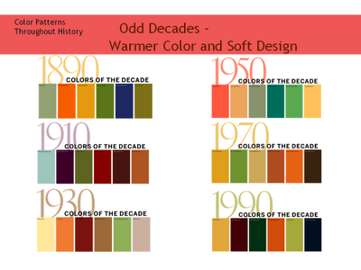
125 Years of Color- Color Patterns per Decade

http://colourific.blogspot.com/2010/06/125-years-of-color.html

Interesting post on blogger from regarding a seminar from Benjamin Moore a few years back.  The images in the posting are actually used in the video Julia sent us today.


How do you think the 2010s will be represented in terms of color....:?

Friday, October 19, 2012

Pointilism Optical Mixing

I've always been a fan of pointilism paintings... I came across this comparison of Georges Seaurat's 
 La Parade de Cirque(1889) 

and this dithered photo of a man.  


It started me thinking about Roy Lichtenstein's use of it in Pop Art work as he emulated the CMYK printing process in large format.


I then started researching DITHERED photos and found this image.  It is essentially a magnified digital image, but I found it very interesting in terms of composition and the use of SQUARE pixels mixing to create an image.  I am tempted to use a more squared off point in my Week 7 assignment to juxtapose the soft lines of the objects in my still life...


Yes.  I am week behind due to a SEVERE cold I came down with last Wednesday and have finally just rid myself of yesterday...