Showing posts with label Julie Li Zhu. Show all posts

Tuesday, November 20, 2012

Metamerism

When developing for garment production, designers always have to check the color correctness of trims and fabrics to make sure the lab dips are true to what their color standards. When I interned at Theory's fabric department this summer, my boss would usually go under the light box to check the colors because normal indoor lighting is not good enough to tell the differences. She'd always write on the headers: 5% more blue, 5% less yellow etc. It was really an estimate she said but I'm sure it takes a lot of experience to do that too. Below are two pictures of zippers and trims under different lighting.


This is someone comparing perhaps a lap dip with the original color under a light box.

This is how the light box look like. Every big fashion companies have at least one.


 This is a pre-owned truck with a bad paint job, probably under bad lighting. Funny. :)

Monday, November 19, 2012

Just wanted to share this

I saw this painting on tumblr and it reminded me of our time of day assignment.
(This is not about Metamerism btw!)


Monday, September 17, 2012

Munsell Reading

I do agree with Munsell that most people refer to colors very loosely and will never be able to verbally describe a color accurately. But this is because most people never have to know the color systems well enough to go on with their lives. If anyone has stopped by a home decor store, one would realize how much variations of colors are available in the form of swatch cards. We will never have to describe a color to anyone when we have a visual reference. The truth is, anything visual can hardly be precisely described without any visual aid. Try to describe anything visual such as a person's features, a piece of clothing, the interiors of a home etc, you will realize how hard it is to explain something visual without actual visual references.

Make no mistake, though, I am impressed with Munsell's color sphere system. It is indeed very comprehensive as he said himself. It is definitely invaluable to the creative professionals as it provides an accurate way to describe colors, consisting of the three critical qualities (dimensions as Munsell called it) - hue, value and chroma. But even with the most comprehensive color systems, designers should never attempt to present their works without visual references. Likewise, the best way to describe music is to actually perform the music for the audience to hear.

Monday, September 10, 2012

Pink - Julie Zhu

The color pink is sometimes described as a tint of red. However a typical pink known today usually lies between the tints of red and magenta. Therefore, it contains the passion of red but at the same time the purity of white, and sometimes, in its cooler tones, the calmness of blue. Today it is usually associated with femininity and love, such as in the pink ribbon for breast cancer awareness and Valentine's day decorations.


The first pink pigment however was far from what we perceive pink today. It was in fact used to describe a yellowish pigment in the seventeenth century. The pink we know today was named after a flower called 'pink', or Dianthus Plumarius.
Pink, Dianthus Plumarius
Pink is certainly not one of the most abundant colors in nature, but it does exist in a variety of living things. Many plants bear pink flowers, such as roses, carnations and peonies. It is much less common in animals. Some of the most well known are perhaps the pink flamingos and pink dolphins. Most people might not have noticed that pigs are pink too (since they are not exactly known for their looks). There are also some species of butterflies that occur in pink. Last but not least, a rare pink insect (a type of katydids) also exists in nature. Its coloration is caused by a condition similar to the human albinism. The condition might seem fascinating to us but it is definitely a great disadvantage for the insect itself since it can hardly camouflage amongst the vast greens of the surrounding plants.

Rare pink insect - a type of katydids

In different cultures, pink can have various symbolic meanings. Jennifer Kyrnin, an experienced web developer and published writer, wrote about the symbolism of colors in different cultures:

Pink
-->

  • Korea: Trust
  • Eastern: Marriage
  • Western: Love, babies, especially female babies, Valentine’s Day
  • Feng Shui: Yin, love
  • Psychology: Used in diet therapy as an appetite suppressant, relaxes muscles, soothing
  • Roses: Gratitude and appreciation (deep pink) or admiration and sympathy (light pink)


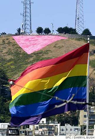
Despite its various positive connotations, pink is not necessarily always a happy color. During World War II, a pink triangle was used in the Nazi concentration camps to symbolize sexual deviance in men, including homosexuality. Modern gay rights movements use the pink triangle to symbolize empowerment and to remember the sufferings.

Pink triangle in Nazi concentration camp during WWII

Pink Triangle - Twin Peaks, San Francisco


The best ways to use the color pink in designs would be those that are associated with femininity, love, happiness and youth. One of the most well known pink logo might be the pink ribbon for breast cancer awareness, which is indeed for a feminine purpose. T-Mobile uses a hot pink color in its logo and it is usually symbolized by a woman in a pink dress in its commercial campaigns. Elsa Schiaparelli was the first to use hot pink, which she termed 'Shocking Pink', in apparels in the 1940s.

Personally, I think that pink is a risky color to use in design for the general public because of its gender specificness in today's popular culture. It should be the last color one could use to design for conservative heterosexual men. I would also be careful when using a pink triangle unless it is intentional.


Sunday, September 2, 2012

Saturday, September 1, 2012

Intro and Questions - Li Zhu

Hi everyone. I am Li Zhu, but I go by Julie. I am from China, lived in Singapore for 8 years and came to the U.S. for college. I have a bachelors in economics from the west coast and decided that I want nothing to do with that by junior year. I am in my second semester in the AAS Fashion Design program at Parsons right now. I do live in Manhattan but decided to take this class online anyways because I have never taken an online class before and thought it might be interesting. And also because I am thinking of getting an internship during the semester so an online class can help me get a more flexible schedule.

I have a couple of questions for the homeworks. I understand we will be painting stuff and I assume our assignments will be very color-sensitive (if you know what I mean)? So won't it be difficult for us to make sure that our colors stay true after we scan or photograph the paintings?

Thanks!
 Julie