Wednesday, December 5, 2012

Week 13 - Music Video Comment


Hello Class, 
as discussed previously with Julia, I'm going to base this assignment on a video different from the one you discussed, since I wasn't able to see the Yellow Submarine video due to German copyright restrictions. 

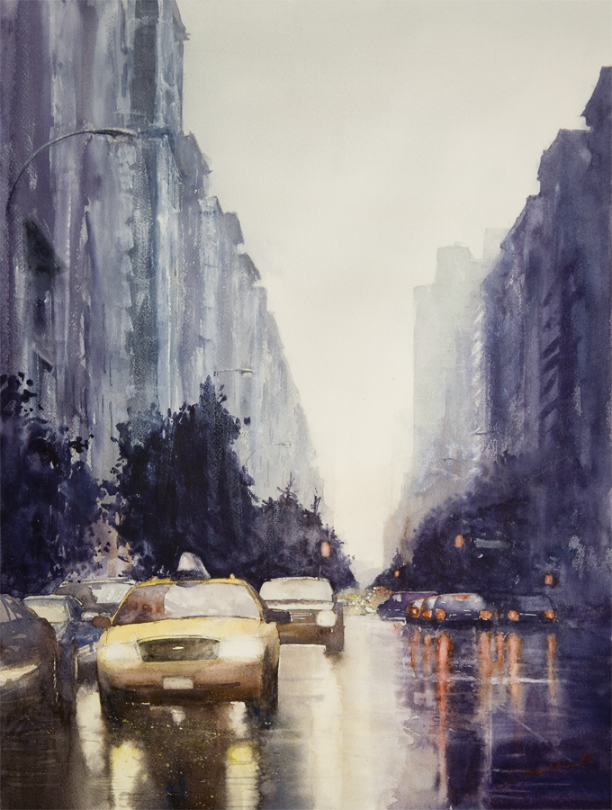
I must admit it wasn't as easy to find a video to discuss once agin due to the copyright laws and also due to the lack of imagination and artistical composition of the videos nowadays. Finally I chose to discuss the music video of "You are a Tourist" from Death Cab for Cutie. I think this video could have had a lot of creative potential because of their usage of light reflections and geometrical figures. Sadly I think the color blocks and the more filigree lights used in the video don't really match. For example I love the bird perspective of the floor in minute 2:40 in which they showcase a city filled with different options while showing circles in complementary contrasting colors over a crossroad. Also minute 3:33 is amazing with all the more muted colors contrast so well with the highly saturated green of the moving windows. But the contrast from minute 3:33 to 3:36 is just too much, although one might argue that the difference of the geometrical forms to the more filigree ones could be seen as a contrasting complement, I think both of them tell a different kind of story. In my opinion if they would have used only the color blocking/geometrical idea the video would had been much better. All the room's, ballerinas and led lights on the musicians are just distracting elements which are not really necessary. I would love to know what you think about it. Here is the link where you can see the video: http://vimeo.com/24569549


Geometrical


Filigree

Thursday, November 29, 2012

Yellow Submarine Yellow Submarine

Oh the good old Beatles. My Dad and his brother are both huge fans, as would be pretty much anyone of that generation? Of course not that they don't have a legacy to be enjoyed by many generations after them, but that was certainly the hey day. I visited a few Beatles spots when I went to London, but I've never been a huge source of knowledge on the subject. On their use of color, I really like the music video. And I really appreciate the art behind it, much more than so many music videos today. Even though the Beatles may have been singing about some unsavory topics (someone brought up Lucy in the Sky with Diamonds), I think at least that the video isn't too in your face with unsavory topics. To clarify, I think that music videos nowadays are taking the "sex sells" idea and just shoving it our faces. Just because it sells, doesn't mean it's the only way to sell. I think the Yellow Submarine video is fun and colorful and makes you feel very whimsical, I was tempted to dance around a little bit. It's all sort of silly, and I like it.

Wednesday, November 28, 2012

Yellow Submarine

I had no idea this movie was inexistence until having to view it for this class. I am so glad though that I now know this movie exists, I wish I could have watched it with my brother. He was a huge Beatles fan. He would have loved the music, I however am more a fan of all the bright colors. The use of color almost makes me feel like I can feel the music tactilely. That may sound funny, but it gives the music another dimension that only well directed and produced music videos can.
For some reason all the crazy colors remind me of an Andy Warhol exhibit I saw at the Denver Art Museum. He was like the king of Pop Art which uses bright colors and certainly isn't subtle and neither is this movie. All the colors with different shapes and dinosaurs and machines eating people gives life to the musical art. I don't know if I would recommend this movie for my nephews and niece today, but surely am disappointed I wasn't able to share the imagery gold with my brother.

Tuesday, November 27, 2012

Yellow Submarine


Strongly saturated, often complimentary colors were regularly used with occasional achromatic palettes in the background to make the colors stand out even more. There was an obvious difference in the colors and graphics used to match the mood of the songs; obvious to the point of being predictable.  So with an upbeat song the fish were a cacophony of colors with fins beating at a frantic pace. With Eleanor Rigby and all the lonely people the visuals were much more simplistic and neutral or achromatic. In between was ‘When I’m 64’, with images that were again simplistic to match the slower beat, but since the song is actually goofy the graphics were again colorful. Just imagine how much more interesting it would have been to have the frantic fish exploding in color to the tune of Eleanor Rigby.  And therein lies the rub. 

yellow submarine

I have always been a fan of The Beatles and Yellow Submarine is one of my favorite albums.  I remember watching the movie when I was a kid and thinking it was the strangest thing I had ever seen.  I still find it an odd movie watching it now.

I never noticed the rythmic movement of the animation before today.  Don't get me wrong, I intuitively understood the idea of stop/limited animation the film used to create the moving image, but I didn't realize how well synced it was to the score.  Not just The Beatles album tracks but the incidental music that helped move the story along.

As for color.  Yes, I think we are all going to agree that there are plenty of saturated, vivid hues in this film that add to the psychadelic look of the 1960s film. But what I found interesting was the contrast between the BLUE MEANIES and the YELLOW SUBMARINE.  Very striking contrast (bordering on a complimentary contrast of BV-YO.)  Love that.

I also, really appreciated the contrast of vivid saturates hues to the muted tones and tints.  The tones and tints were usually used in more somber unhappy moments and the vivid pure hues were used in happier joyous moments/characters.

My thoughts on the Yellow Submarine


The “Yellow Submarine” is a very colorful and graphic animation movie. It is highly reflective of the organic shapes, clashing colors and almost hypnotizing contrasts in the 70s. The following are some of the way color was used in a powerful way to compliment the music and the narrative of the story:

  • In the opening scene, Pepperland was a harmonious and happy place. The scene had an organic and hand-drawn illustration quality, and was composed of whimsical objects, floral and foliage in backgrounds, and vibrant warm colors of greens, yellows and reds. All these elements suggested of harmony and nature. A cheerful classic music was playing in the background.
  • In the scene where the villains “the Blue Meanies” appeared, the backdrop has been changes to a bleak monochromatic white and grey scheme, with the villains colored in contrasting deep blue. The cool and harsh color scheme is strikingly different from the previous scene. The music also changed from harmonious to dramatic and sharp. As the Blue Meanies attacked the people of Pepperland, and all victims that were frozen and turn into black and white statues, further emphasizing the contrast between the two worlds.
  • In the scene of “All the Loney People”, we see a backdrop of the grey cityscape of London, and this time, the graphic is more photo-like and realistic, giving us a sense of seriousness and reality compared to the organic hand-drawn illustrations before. This of course corresponded with the seriousness of the music and lyrics of the song. With this backdrop, the bright yellow of the submarine really stood out, creating a strong focal point.
  • At the large whimsical mansion where the members of the Beatles were living, it is interesting to see the different theme, music and colors in the different rooms. For example, the India room has a warm, deep violet color scheme, and had Indian music as the background music. The interior hallways of the mansion also had neutral colors and simple design, creating a contrast to the rooms, which were overfilling with whimsical and colorful characters and objects.
  • In the Yellow Submarine” underwater “scene, the graphic was very vibrant and energetic, very much like the beat and the pulse of the song. The fishes had contrasting colorful patterns, which flashed in tune with the beat of the song. The contrasting stripe patterns on the sea rocks also added to the busy and mesmerizing scene.

Metamerism examples in interior design

One example of metamerism I have personally encountered is the impact of lighting on wall paint color. I am sure many of you have picked a wall paint color in a store based on the samples, and when you actually paint your wall at home, the color appears warmer.

This is due to the different light sources used in the store and at home. Fluorescent lighting is usually used at the hardware stores, causing the color samples to have a cooler tint. On the other hand, the lighting we have at home is usually sunlight or incandescent lights, so the paint color will look warmer.


Another example of metamerism is the effect of finishing/texture on color. On glossy or polished surface, more light is reflected, creating the illusion of a cooler color. I have tried to apply a semi-glossy paint to a wall in a neutral muted grey color, and due to the reflective finish of the paint, the color actually appeared to be violet during daylight.


Tuesday, November 20, 2012

Metamerism

When developing for garment production, designers always have to check the color correctness of trims and fabrics to make sure the lab dips are true to what their color standards. When I interned at Theory's fabric department this summer, my boss would usually go under the light box to check the colors because normal indoor lighting is not good enough to tell the differences. She'd always write on the headers: 5% more blue, 5% less yellow etc. It was really an estimate she said but I'm sure it takes a lot of experience to do that too. Below are two pictures of zippers and trims under different lighting.


This is someone comparing perhaps a lap dip with the original color under a light box.

This is how the light box look like. Every big fashion companies have at least one.


 This is a pre-owned truck with a bad paint job, probably under bad lighting. Funny. :)

Metamarism


The first time I got in contact with this term was while working at a design / advertising agency. We were producing a catalogue for a local department store and our client was obsessed with matching the colors of the printed catalogue with the actual fabrics. 

I remember going to the printing factory in order to make sure that all the surfaces, textiles and paper, were reproduced exactly under some specific light. (The one they got in the store and daylight) At first I thought it was going to be an easy job, but when I got there almost every color differed from the actual color in the textiles. What I thought would be the work of one day become a week, we constantly had to print out samples and compare them to the textile swatches under a "light source" which simulated different lights. 

After having matched almost all the colors exactly, I realized how important this part of the work was. Because, if we hadn't done that many clients would have been disappointed while coming to the store to find the garment they had see in the catalogue.  

Monday, November 19, 2012

Metamerism Examples

I think nothing screams Metamerism more than... getting dressed in the wee hours of the morning with very little incandescent light in the bedroom and thinking you have on two black socks....


..... only to get in front of the fluorescent light of the office or a day-lit street - just to find you have on one blue sock and one black sock!

Fashion Failure!

Just wanted to share this

I saw this painting on tumblr and it reminded me of our time of day assignment.
(This is not about Metamerism btw!)


Sunday, November 18, 2012

Metamerism


Metamerism is a difficult concept to wrap one’s head around, however in layman’s terms it is loosely defined as a change in apparent color under different light sources. A couple of examples of, metamarism or metamers are; bridesmaid dresses being made from the same dye lot. Metamerism is the reason why it is suggested that all bridesmaid dresses are ordered and created at the same time to prevent a mismatch of color.

 
Another example, the necessity to paint a room in one sitting, rather than paint a bit at one time and paint the rest at another time. It creates a mismatch of shades.
 

Friday, November 16, 2012

Can you see me now?

I didn't totally grasp the daily life effects of metamerism until I started to look for more examples. Now I realize that it could have major effects in the fashion industry, in sourcing and color matching. Similar to starlets getting on the red carpet and realizing that their dress is see-through under the lights, designers and brands need to be cognizant of the effects of metamerism as their garments are viewed under different lighting on display, outdoors, and on the runway.


http://info.gtilite.com/2011/02/metamerism/


http://photobusinessforum.blogspot.com/2007/03/metadata-and-mermaids-metamerism.html


Wednesday, November 14, 2012

Metamerism Examples

Sample metamerism: This is where the color appears different under different lighting conditions. The truck door color may have matched the rest of the truck under artificial light when it was painted but no longer did under sunlight.


Observer metamerism: This has happened even in this class, where someone describes a color as red-violet or blue-green and I will think, that's not what I see. So this is a difference between individuals in the colors that they see i.e., differences in color vision.

http://the-print-guide.blogspot.com/2010/05/issue-of-metamerism-in-print-production.html


Tuesday, October 23, 2012

125 Years of Color- Color Patterns per Decade

http://colourific.blogspot.com/2010/06/125-years-of-color.html

Interesting post on blogger from regarding a seminar from Benjamin Moore a few years back.  The images in the posting are actually used in the video Julia sent us today.


How do you think the 2010s will be represented in terms of color....:?

Friday, October 19, 2012

Pointilism Optical Mixing

I've always been a fan of pointilism paintings... I came across this comparison of Georges Seaurat's 
 La Parade de Cirque(1889) 

and this dithered photo of a man.  


It started me thinking about Roy Lichtenstein's use of it in Pop Art work as he emulated the CMYK printing process in large format.


I then started researching DITHERED photos and found this image.  It is essentially a magnified digital image, but I found it very interesting in terms of composition and the use of SQUARE pixels mixing to create an image.  I am tempted to use a more squared off point in my Week 7 assignment to juxtapose the soft lines of the objects in my still life...


Yes.  I am week behind due to a SEVERE cold I came down with last Wednesday and have finally just rid myself of yesterday...


Monday, October 15, 2012

Pointillism finds

I find it so interesting little points of color like "pixils" complied closely together or far apart, accompanied with dark or cool colors to emphasize shadow and depth.

Paul Signac, Sunday, 1888-1890

Pointillism Bunki Kramer

"Billie" Denise Landis

Thomas Leslie Conroy

Pointillism - Neue Pinakothek Munich

For this weeks assignment, I decided to go on a Museum trip to the "Neue Pinakothek" here in Munich, Germany. Since this one displays a variety of European Art paintings of the 18th and 19th century. It is known as one of the most important museums of art of the nineteenth century. 

Here my finds about Pointillism: 


Theo van Rysselberghe (1862 - 1926) "Springbrunnen im Park Sanssouci in Potsdam, 1903" 
Study of a Fountain / Sanssouci Palace, Germany 


Georges Pierre Seurat (1859 – 1891) "The Seine and la Grande Jatte - Springtime 1888" 
Normally exhibited at the Royal Museums of Fine Arts of Belgium 

In my visit to this museum, I realized how Seurat´s Pointillism technique had evolved in time. For example in Vincent van Gogh's and Henry van de Velde's paintings you can see that the brush strokes become more comma shaped than dotted. Here some examples: 


Henry van de Velde (1863 - 1957) "Garden in Kalmthout - 1892"


Vincent van Gogh (1853 - 1890) " View of Arles - 1889"

Looking forward to see your paintings! 

Inv. Nr. 8662

Sunday, October 14, 2012

Pointillism

Pointillism branched out from Impressionism during the late 1880s, and I found quite a few striking example of this technique by famous artists from that period:

Georges Seurat used a light and muted palette to achieve a diffused, hazy impression of his landscapes, as if you are looking through a misty rain or a textured glass window.


La Tour Eiffel, 1889, Georges Seurat (1859–1891)


View of Fort Samson, 1885, Georges Seurat (1859–1891)


Vincent van Gogh also used pointillism in some of this paintings. In the self portrait below, he used contrasting warm and cool colors to create sharp highlight and shadows on his facial features, as well as adding energy and vibrancy to the background. In particular, he used a cool green to add contrasting shadows on his face and hair, and this corresponds with the color of his eyes, his tie, the trimming on the collar, and the background.


Self-portrait, 1887, Vincent van Gogh (1853–1890)


In many of his other works, he also used optical mixing, but using directional brush strokes instead of points.


The Starry Night, 1889, Vincent van Gogh (1853–1890)

I also like the following painting by Belgium artist Georges Lemmen. I think it is very successful in capturing the brightness of the yellow and orange light during sunset by using pointillism.


The Beach at Heist, 1891/2, Georges Lemmen (1865 – 1916)

Wednesday, October 10, 2012

Pointilism example

This is a little bit different from what we are doing this week because it is black and white, but I found it so compelling I had to post it as an example of pointilism.


This is 'The Thinker' created by contemporary artist Aaron Baggio using black ink. The effect is achieved by creating different values by altering the concentration of dots in an area.

Tuesday, October 9, 2012

Adelson

A bit heady of a reading.... 

DEFINITIONS:
Low-level vision: our eyes processing of raw visual data.
High-level vision An assumption of what our eyes see based on actual visual data and our experience of similar objects.
Mid-level vision: A mid point between Low Level Visions and High Level Vision.
Luminance is the amount of visible light that comes to the eye from a surface
Illuminance is the amount of light incident on a surface
Reflectance is the proportion of incident light that is reflected from a surface

I think it's fair to assume most of us in everyday life operate in Mid Level Vision most of the time.

I think the best way to understand this is to think of a Computer Monitor displaying a picture.  

Display at LOW LEVEL would be a very pixel-ate/noisy picture without detail.  


Display at HIGH LEVEL would be very shape based, low detail, and mostly inferred.  Similar to rendering an a 3D image in say 3D max prior to applying material to it.  Very crude shapes and contours.  This is very common with young kids who confuse objects based solely on shape and size.  Dog or Horse?


MID LEVEL is the merging of these two levels to create a complete image.  


Lightness Perception - Monica Ramirez


Edward Adelson's reading clarifies the way our visual system perceives light. Every day our visual system faces thousand of objects waiting to be defined, so it  uses a complex (stringent) processes to recognize them. But given that this process is so strict it can also be deceived, since not always what we perceive corresponds to the reality. I wonder if this is a learned process or if our visual system would react different while being in another environment. 


While reading this abstract I also couldn't stop thinking about how this explanations relate to the work of MC Escher a dutch graphic artist which experimented with optical illusions using mostly shades of grey.

Monday, October 8, 2012

Pointillism - Seurat


Here is a portion of one of Georges Seurat's most famous pointillism paintings, The Sunday Afternoon on the Island of La Grande Jatte. Per Wikipedia, "A Sunday Afternoon on the Island of La Grande Jatte shows members of each of the social classes participating in various park activities. The tiny juxtaposed dots of multi-colored paint allow the viewer's eye to blend colors optically, rather than having the colors physically blended on the canvas. It took Seurat two years to complete this 10-foot-wide (3.0 m) painting, much of which he spent in the park sketching in preparation for the work (there are about 60 studies). It is now in the permanent collection of the Art Institute of Chicago."

I know this work because at the end of Mission Impossible 2, Ethan and his lady disappear into a very similar looking park in Australia. The use of pointillism creates beautiful color in the painting. 


Brittany Boehm's post on Adelson

I need to first state that most of Adelson's theories on light, perception, and illusions were lost on me. I have never been great at visual or auditory senses. Though, what I can relate to is how our mind plays tricks on us. When Adelson quoted Ruskin, "Every light is a shade, compared to the higher lights, till you come to the sun; and every shade is a light, compared to the deeper shades, till you come to the night." (1879), it reminded me that all perception and illusion is individual and the mind doesn't always see what truly is there.
All of life is seen through our own perceptions and experiences. One person may see a brilliant red color in the flush of a loved one's cheeks while another may see roceasa in a stranger's face. Same base hue of red, very different perceptions. I think that is why I love color and Color Theory so much, while there are concretes in this field of study, it is all subjective and manipulative.

Adelson's Perception of Lightness


In his article, Adelson described the theories which scientists have developed to explain the perception of lightness by the human eye. Our visual system processes light in the retinal image received by the brain, adjusting the illumination and other viewing conditions and estimating the reflectance to obtain lightness constancy. As a result, we are able to perceive properties such as color, size, shape of objects in our surroundings.

The multi-level visual processing system
The visual system processes information at multiple levels of sophistication, classified as low, mid and high-level vision.

Low-level vision includes light adaptation and the center-surround receptive fields of ganglion cells. Adaptation and local interactions at a physiological level are the crucial mechanisms of low-level vision.

Mid-level vision is the region between low and high-level vision. The representations and the processing in the middle stages involve surfaces, contours, grouping, etc.  Mid-level vision emphasized the importance of perceptual organization, including grouping, belongingness, and good continuation, proximity.

High-level vision includes cognitive processes that incorporate knowledge about objects, materials, and scenes. This explains the phenomena that perception is the product of unconscious inference. A lightness judgment involves the workings of the whole visual system, and that system is designed to interpret natural scenes. Lightness constancy is achieved by inferring, and discounting, the illuminant. Simultaneous contrast and other illusions are the byproduct of such processing.

Measuring light in scientific terms
Luminance, illuminance, and reflectance, are physical quantities that can be measured objectively by physical devices. Luminance is the amount of visible light that comes to the eye from a surface. Illuminance is the amount of light incident on a surface. Reflectance is the proportion of incident light that is reflected from a surface. In scientific terms, an illuminance image, E(x,y), and a
reflectance image, R(x,y), are multiplied to produce a luminance image, L(x,y):

                                    L(x,y) = E(x,y)R(x,y)

Real life examples
The scientific founding highlighted in this article is very crucial in design. The visual perception is fundamental to design and designers must understand how the physiological and cognitive visual processing will affect the viewer’s perception. In fact, some artists and designer have been able to manipulate the viewer’s visual perception to achieve some interesting results. Here are some examples:


Artist Julian Beever's sidewalk illusions, manipulating viewers' perception of light to achieve the illusion of depth and shape.


Application in interiors (demonstrates grouping)


Eureka car park illusion (demonstrates figure)


Sunday, October 7, 2012

Perception of Light

The most interesting and thought provoking statement in the article for me was that ‘vision is only possible because there are constraints in the world’. I immediately started to try to mentally disprove this with various examples which was impossible, but it made me really think about it. So the ‘high level vision’ that incorporates knowledge about a finite number of options has to kick in to inform the ‘low level vision’ which provides information about light within a restricted environment.  The middle level vision is the rest in-between. Otherwise I had difficulty with sections of the article because I needed a better understanding of the technical vocabulary.

The other terms I did understand as they describe different things: luminance as the amount of visible light entering the eye form a surface; illuminance as the amount of light on a surface, and reflectance as the amount of light reflected from a surface. However, I had some trouble with the application of these definitions as I tried to guess how p, q, and r on the checker block related to each other in accordance with these terms and was regularly wrong.

As far as a real life example, I wonder if these principles affected my results from this week’s assignment. I generally paint in the morning by natural light from a north facing window. However, later in the day some of the colors looked really different when at the time of painting I was very comfortable about how the color-aid swatches matched my paint mixtures.  It was variably cloudy all day, and since I was at it for hours I’m thinking the amount of light influenced all of my decisions; my color-aid selections, the paint mixtures, and how they matched each other within a given time-frame.

Thursday, October 4, 2012

Adelson's Lightness


Admittedly, Adelson’s paper has me out of my depth. I had to read each paragraph two or three times to try to understand the message. I did particularly enjoy the optical illusions though, and after a couple of readings could grasp most of what was being conveyed about our visual perception systems in so far as they related to the illusions. My preferred section of the paper was Helmholtz view that “what we perceive is our visual system’s best guess as to what is in the world.” I’ve always found optical tests interesting in so far as the brain can sometimes compensate for things the eyes cannot see. I’ve also always been fascinated to know if what one person sees and perceives from an image can differ from another. Like image if what I thought was blue actually looks like green to someone else, but we’ve both been taught to call that hue blue? The world could look entirely different to someone else, but we’ve been taught to associate certain words with images and colors, and so we’re all speaking the same language but seeing different things…

The real-world application for these types of studies I think most manifest themselves in the fashion industry in so far as consumer populations are living longer, and eyesight is one of the first human faculties to degrade. Paco Underhill’s Why We Buy: The Science of Shopping delves into marketing considerations that will need to be made by brands who are attempting to capture the purchasing dollar of an aging society. For example, the ability to perceive yellow against a white background, or to perceive any text at all if the contrast between the text and the background is not great enough. These visual considerations, as well as basic considerations of text size on product labels, are very important to remember in both product design and marketing.

Definitions

Low-level vision: at the retina, including light adaptation and the center-surround receptive fields of ganglion cells

Mid-level vision: ill-defined region between low and high level vision. Thought to involve surfaces, contours, and grouping

High-level vision: includes cognitive processes that incorporate knowledge about objects, materials and scenes

Luminance: the amount of visible light that comes to the eye from a surface

Illuminance: the amount of light incident on a surface

Reflectance: the proportion of incident light that is reflected from a surface