Julia,
I was wondering if you could give us a brief discussion of what your responsibilities were as art director in the short film (The Problem of Gravity)? I have no experience in this area, and since we had a chance to see the film it would be interesting to know what your hand was in it, i.e., what part of a film the art director influences.
Looks like it won too, so congrats!!!
Saturday, September 29, 2012
Thursday, September 20, 2012
African American Quilt's

Monday, September 17, 2012
Munsell Reading
I do agree with Munsell that most people refer to colors very loosely and will never be able to verbally describe a color accurately. But this is because most people never have to know the color systems well enough to go on with their lives. If anyone has stopped by a home decor store, one would realize how much variations of colors are available in the form of swatch cards. We will never have to describe a color to anyone when we have a visual reference. The truth is, anything visual can hardly be precisely described without any visual aid. Try to describe anything visual such as a person's features, a piece of clothing, the interiors of a home etc, you will realize how hard it is to explain something visual without actual visual references.
Make no mistake, though, I am impressed with Munsell's color sphere system. It is indeed very comprehensive as he said himself. It is definitely invaluable to the creative professionals as it provides an accurate way to describe colors, consisting of the three critical qualities (dimensions as Munsell called it) - hue, value and chroma. But even with the most comprehensive color systems, designers should never attempt to present their works without visual references. Likewise, the best way to describe music is to actually perform the music for the audience to hear.
Make no mistake, though, I am impressed with Munsell's color sphere system. It is indeed very comprehensive as he said himself. It is definitely invaluable to the creative professionals as it provides an accurate way to describe colors, consisting of the three critical qualities (dimensions as Munsell called it) - hue, value and chroma. But even with the most comprehensive color systems, designers should never attempt to present their works without visual references. Likewise, the best way to describe music is to actually perform the music for the audience to hear.
A Colar Notation by A. H. Munsell-Brittany Boehm's thoughts
A Color Notation by
A.H. Munsell is full of imagery, it presents to the reader such depth of
knowledge on the character of color. When reading this article it is hard to
not get focused by all the terms and meanings of such simple adjectives such as
light and dark. One thing hard to disagree with is that color is hard to define
and adequately describe. Early on in the article, Munsell gives the impression
that color is subjective. This is something that has always been intriguing.
One cannot help but think of little children learning their colors. Who’s to
say that if a child was taught that the color green was actually the color red,
they might not think the color green is red for the rest of their lives?
Though, quickly Munsell explains that while many may think color is subjective,
it is actually quite objective.
When reading about the three aspects that all color is defined
by, hue, chroma and value, one is struck by the fact that not only does color
need a system to define itself, it also needs to be explained more clearly when
first introduced and taught. There are so many aspects of color that the
majority of the population gets wrong. Never did it occur that tone is not an
appropriate way to describe color. So many times it has been utilized to describe
the value of a color. But rarely do children learn about color value, rather
they are taught that one tone of color is darker or lighter than another. One
can go on and on about all inaccuracies found in color education, thought
suffice it to say that Munsell paints a very vivid picture that to understand
color is almost as hard as understanding life!
Thoughts on Munsell's "A Color Notation"
In his article, Munsell proposed a spherical system to notate colors
on three dimensions – hue, value and chroma. He draws a lot of similarities
between the musical scale and his system, which classifies color accordingly to
hue (5 colors), chroma (1 to 10) and value (1 to 10).
A color system such as the one proposed could be a very
useful tool in the design process.
By using a systematic way to describe color, the information can be
communicated clearly and interpreted accurately during the design and production
process. The systematic classification of color is also a very useful reference
guide to color selection, especially when you are looking for the different
variations of a hue.
However, while I agree that using a system such as the one
proposed would be useful in the communication and apprehension of color, I
believe that such a mathematical system disregard that the perception of color
is highly influenced by the viewer’s emotional, cultural, and cognitive
preconceptions. Color carries a
lot more information then just the hue, value and chroma, and isolating the
colors from these attachments would remove the social and personal context to
fully appreciate a color and would limit the imagination and creatively of a
designer.
There are also some potential limitations to the application
of the color system proposed. Firstly, the range of colors is actually
infinite, so although the classification system will help in describing the
quality of the colors, it will not be sufficient to notate all the color
variations. Secondly, the suggestion that we can use the standard intervals to
determine the triads or combinations that would result in harmony is a good
guideline, but combining colors is a lot more complex than combining musical
notes, and depends on many other factors such as the arrangement of colors in a
space, the lighting, and the surrounding environment.
Monica Ramirez - "Munsell's Color System"

I'm a very visual person, so while reading the text about "Munsell's Color System" I got quite confused. At first, I totally understood why he saw the necessity of inventing a system in which all the colors that we see could be classified. But then when they started to describe the color qualities and the operation of the globe, I got totally confused. This was till I researched the system on the web and saw the tridimensional globes, after this all made sense. I really like how precise this system can be!
After having read our lecture note, I decided to research a bit more about this system to find out if it was still actual and in use. I was pleasently surprised to see that "modern day color theory and mathematical color system is based on Munsell's theory color". In fact, there is a company which has decided to continue its legacy. http://munsell.com Take a look at this nice site to dip even more into this color world. I recommend their blog, which is very interactive and informative.
The only question I have after this reading, is why this color system is so common in the US and in other countries like China but not in Europe? Here we only hear about Pantone and it's color System... Does someone know?
Thoughts on Munsell reading
Introduction was wonderful. I even read it (and translated) to my Dad who works with designers and knows too well situations like one described. Often his clients don't know how to describe a certain color, so they end up with saying "...send me some - many - patterns of the exact shade". And the search begins. I also loved example about child's experience and struggles with colors. The most important part, of course, is about tri-dimensional nature of color, which was perfectly illustrated with an orange example. This "experience" was easy to follow and visualise. The article certainly does a great job in providing clear descriptions and explanations about hue, value and chroma. Illustrating mistakes, which people often make in connection to these three dimensions of color, was also helping (mistakes were recognisable, I have to confess).
Now I'm coming to points with which I don't agree or have a hard time to understand. First of all, apart from example with orange, descriptions of color schemes and systems are very hard to follow. Yes, English is not my native language, but I suppose even native speakers struggled to understand and visualise. So confusion and lots of questions were left. Second point is, if I understood correctly, author is not very keen on using musical terms in color theory. For me, though, it is extremely helpful. Aside from having better understanding in musical terms, I am a person who has associative way of thinking. So I tend to "connect" certain color with particular song or even sound. Hence, using "instruments" from music theory is very understandable to me. Third point is about color naming. Maybe it's because Color Theory course is only several weeks young and I'm only starting to think about color technically, but I don't agree that popular color names are "incongruous, irrational, and often ludicrous". For me, "olive green" has very clear meaning and I easily visualize the color. I also have to say, that I struggled to keep up with disciplinary information. And question "Does such scientific scheme leave any outlet for feeling and personal expression of beauty?" came just in time. When I reflect on color, the last thing I consider is scientific approach to naming and complex color schemes. I do think about artist's freedom of color interpretation, which is very subjective and therefore can't be schemed. I can't imagine Van Gogh starring at his sketches, trying to implement correctly named colors from available systems. Yet, as I progressed with reading (and with Color Theory and Fashion Design: Photoshop courses), I do see the ratio in building unified color schemes and being precise with color naming.
Quotes are taken from "A Color Notation" by A. H. Munsell, Geo. H. Ellis Co., Boston, 1907.
Sunday, September 16, 2012
Color Names
In the first chapter the author spent much effort showing his irritation with the lack of a scientific approach to describing color. I would absolutely agree that defined terms that have specific meanings are necessary in the vocabulary of color, and the article articulated the differences between hue, value, and chroma in ways that made sense to me. The scientific definitions of hue, value, and chroma were especially illuminating. The definition of hue as resulting from wavelengths hitting the retina is clear, as was value as the light of a color defined by the amplitude of the wave. It was also helpful to have value further related to tint or (sometimes incorrectly) shade. However, the discussions around chroma were especially useful as I was having difficulty understanding its meaning, particularly in association with the chromatic scales. Chroma is the strength of color and can be thought of as the purity of one wavelength. When intermingled with other wavelengths it becomes less pure. Somehow, this made way more sense to me than adding in grays or black for the chromatic scales, or the complimentary color as we did with the quilt exercise. But now I look at my quilt and understand that in the middle squares the chroma of the parent colors is weakened.
The color sphere also made sense to me, but I did not follow the equation i.e., every color can be recognized, named, matched, imitated and written by its hue, value, and chroma, where Red 5/9 means [value (5)/chroma (9)] = vermilion, because it seems like the resulting pigment could be somewhat variable depending on the originating hue (i.e., a cool versus a warm red). However, it is certainly important that everyone in the color conversation is speaking the same language. I work in a part of the medical profession where a specific vocabulary is used to communicate information, and sometimes individuals ignorant of the nuances will make editorial changes in written documents that completely change the meaning and intent. This can lead to unfortunate consequences. I can see where that could also easily happen in the fashion industry in relationship to color.
Color Forecasting website
Hi All,
Here's a color forecasting website that is similar to the NSKYC project mentioned in this week's lesson. Basically the software captures the color of the clothes on people walking by in Paris, Milan, and Antwerp, and calculates the trending color.
http://www.pimkiecolorforecast.com/
Here's a color forecasting website that is similar to the NSKYC project mentioned in this week's lesson. Basically the software captures the color of the clothes on people walking by in Paris, Milan, and Antwerp, and calculates the trending color.
http://www.pimkiecolorforecast.com/
Saturday, September 15, 2012
Laurie Fleming -Week 3 A Color Notation
Hmmm... I began reading this and at first I was totally humored by the introduction. I was it as a artist having this grand project in mind. He could see it in the making and seeing the finished product in every single room. But when it came to conveying that exact color that they envisioned in his head, he couldn't quite give the person a color that totally completed the vision. And being what seem to be totally arrogant that of course no one other than he, the artist, could pick out the right colors from his head. Narcissistic to me.
Now after that, I found it very hard to understand what I was reading. So from what I head. I understand that people not able to accurately describe colors with what they have seen before or imagined it to be in associations with other things or nature. I understood that the 2D doesnt really express how our eye naturally sees things in color and in depth. So we had to come up with a way to give realism to how we display what we see in 3D, with hues, value, and chroma. And coming up with a way to display the full array of colors that fall between the primary colors.
In my looking as the different ways that these charts have been displayed I found that the spherical one made more since to me because I could see the direct complimentary colors to a particular color.
After that, I feel like I got lost again, but as I think about it right now. It seems it show the definite importance of communication. Especially in conjunction with relating ones artistic endeavors to others, you have to have something tangible that everyone can relate to so to get the point across.
I could be totally wrong... but thats what I got out of it.
All that being said. I agree to the system.
Thursday, September 13, 2012
Tim Capalbo Munsell Reading Week 3
I found the reading to be a bit "intellectual" in nature and at times, hard to follow, and had to re-read paragraphs twice and sometimes three times before I completely understood what Munsell was even suggesting. I like to consider myself a fairly smart man, by the way. However, once I figured it out, I got it. And I can see why the US would adopt this method of defining color. I hope, however, they are using a more basic approach to teaching this to people in regards to the vernacular used.
I found it interesting that Munsell referred to the 5 basic colors as Red, Yellow, Green, Blue and Purple. And when I learned color way back when, the colors of the "rainbow" (the prismatic colors) were ROY G BIV. He makes no mention of Orange or Indigo (and calls Violet: Purple). When he does mentions Orange, he refers to it as Yellow-Red. It made me wonder when the word "Orange" came about in terms of color (I'm looking at the blog and no one researched this color...) But I am digressing...
I find the numerics an interesting concept and completely agree that color names are bit, let's say, "silly" at times (man if Munsell could hear the names we come up with now to describe colors...!) It could be helpful in terms of defining a color to another Interior Designer for example, however, I don't foresee your average client learning this system and being able to convey color choices this way. And from what I've read thus far on the subject, I actually think the Pantone Method of Color Coding is MUCH more precise in terms of defining a hue using a 0-100% scale rather than a 1-10 scale.
Tuesday, September 11, 2012
Color Green by Monica Ramirez (Week 2)
Introduction to the color Green
The color green is a one of the primary colors of the additive color mixture (beside red and blue). In subtracting color mixing, green is achieved by mixing the colors cyan and yellow. Its complementary color is magenta in the RGB (additive) color wheel and red in the RYB color model.

- RYB Color Model -
What does the color green symbolize?
As the main color of the vegetation, green is associated with life and growth. Ancient knowledge tells us that our survival is assured only if once again fresh green sprout from the earth. Which is why green is a symbol of hope and confidence. This explains, why in our culture, it is a tradition in the winter to have an evergreen Christmas tree in the living room. (So it was already in pre-Christian pagan times.)
Also, the greening in the spring stood in the middle ages as a symbol of the nascent love, which is why green is also considered a color for the new love. In Old Palestine brides wore a green wedding dress to the hope of a happy life and fertility.
Green is the color of the Islam. The Prophet Muhammad is said to have dressed preferably in green. Which is why you can notice several green decorative elements held in mosques. The flags of many Muslim countries contain green, among those, the flags of Saudi Arabia, Mauritania and the former flag from Libya (1977 to 2011).
In Christianity, green is the color of the resurrection. Which is why green is the color of easter, green as in the spring green.
Green is also the color for signalizing that something is normal, positive or proper. It is used to identify processes that work or are allowed. Although intense shades of green are referred to as "poison green". This is because, as read previously, most of the developed green pigments were toxic. Green is also associated with the evil, many medieval poets drew connections between the color green and the devil.
Green Pigments!
It is believed that the egyptians were the first ones to create a green pigment, the malachite. Found mainly in their tomb paintings.

- Osiris - The Great Green -
(In ancient Egypt green represented protection)
- Malachite (basic copper carbonate) is a secondary mineral of copper which is found in many parts of the world. The natural pigments of this mineral were made by crushing the mineral, ground to a powder.
But there is also an artificial way of creating this pigment, this method was commonly used in the middle ages in Europe, is to be added potash, lime and salt ammoniac to a soluble copper salt such as copper sulphate or sulfite. And so the copper sulfate reacts with the sodium carbonate to produce a basic copper carbonate, which is finally the pigment. This artificial pigment is mainly known as copper green.
- Another natural pigment which is used since ancient times is, Green Earth. This pigments is also seen in the late Egyptian art, but it was more frequently used in medieval paintings. Green Earth is made out of the natural material glauconite or celadonite, which are micaceous structures found in submarine elevations of ancient seabeds and in sedimentary rocks of different geological systems. The pigment is produced, as in the case of many of the natural pigments, by grinding the natural material.
- The Greeks were the first ones to create an artificial pigment, which they called Verdigris. This was then often used through the Middle Ages, Renaissance and Baroque because of its unique vibrancy. Verdigris was discontinued in the 19th century due to its toxicity.
This pigment was commonly made in wine growing areas because one of the components needed for doing Verdigris is a sub product of winemaking. Verdigris was done by resting copper plates into wine mark, because the resulting acetic acid, from the wine mark, reacts with the copper forming a green / blue crust which is then scraped of and ground.
After that, most of the green pigments that were produced were artificial ones. This was due to the intense improvements in chemistry. In the late 18th century a new generation of greens was introduced. These were cobalt green, emerald green and viridian.
Cobalt Green:
This pigment was created by the Swedish chemist, Rinmann in 1780. Cobalt green was made by mixing the compounds of oxides of zinc and cobalt with an alkaline carbonate. Then the mixture had to be heated and after washing the sediment that resulted, the pigment was ready to be ground.
Emerald green:
Emerald green was a pigment, that was quickly embraced by society in the 19th century due to its beautiful color and its inexpensive production costs. This pigment was used not only for artistic purposes but also for painting homes. The problem was, that this pigment contained many toxic fumes which caused many cases of poisoning among the population.
This pigment is produced as a reaction of sodium arsenate with copper-acetate. Emerald green is also known as "Schweinfurt Green" due to its commercial origin in the little town of Schweinfurt, Germany. Justus von Liebig and Andre Bracconot are known separately for being the ones who invented this pigment.
Viridian
It is said, that Viridian is one of the best green pigments ever made. This is due to its very stable powerful cold green and its lack of toxicity, since it doesn't contain copper. Viridian pigment is made by calcining a mixture of boric acid and potassium bichromate and washing the material which is formed. The first one in creating this pigment, was Pannentier, a parisian color maker.


Melachite - Green Earth - Verdigris - Cobalt Green - Emerald Green - Viridian
(Pigments described above)
Green in Nature

- Malachite Stone -
Since many plants contain Chlorophyll, green is the main color of the vegetation. In nature it is seen especially in the spring, aside from the tropics, where the plants are constantly green. Green is a color which also appears in various components of nature such as in animals, stones and gem stones.
What is the best possible way to use this color in design field?
After reading so much about the this color, I would say that green would be an excellent color for the use in any space that has to be filled with confident /positive thoughts. Which is why I would recommend to use this color in space like living rooms, "creative rooms" in offices and in hotel lobbies. All this spaces need the good energy that green provides.
Resources:
- http://en.wikipedia.org/wiki/Green
- http://www.webexhibits.org/pigments/intro/greens.html
- http://www.naturalpigments.com
- http://www.cornelissen.com/
- http://www.hobby-island.co.uk/
- http://www.cornelissen.com/
- http://www.hobby-island.co.uk/
Monday, September 10, 2012
Pink - Julie Zhu
The color pink is sometimes described as a tint of red. However a typical pink known today usually lies between the tints of red and magenta. Therefore, it contains the passion of red but at the same time the purity of white, and sometimes, in its cooler tones, the calmness of blue. Today it is usually associated with femininity and love, such as in the pink ribbon for breast cancer awareness and Valentine's day decorations.

The first pink pigment however was far from what we perceive pink today. It was in fact used to describe a yellowish pigment in the seventeenth century. The pink we know today was named after a flower called 'pink', or Dianthus Plumarius.
Pink is certainly not one of the most abundant colors in nature, but it does exist in a variety of living things. Many plants bear pink flowers, such as roses, carnations and peonies. It is much less common in animals. Some of the most well known are perhaps the pink flamingos and pink dolphins. Most people might not have noticed that pigs are pink too (since they are not exactly known for their looks). There are also some species of butterflies that occur in pink. Last but not least, a rare pink insect (a type of katydids) also exists in nature. Its coloration is caused by a condition similar to the human albinism. The condition might seem fascinating to us but it is definitely a great disadvantage for the insect itself since it can hardly camouflage amongst the vast greens of the surrounding plants.
In different cultures, pink can have various symbolic meanings. Jennifer Kyrnin, an experienced web developer and published writer, wrote about the symbolism of colors in different cultures:
Pink
-->
Despite its various positive connotations, pink is not necessarily always a happy color. During World War II, a pink triangle was used in the Nazi concentration camps to symbolize sexual deviance in men, including homosexuality. Modern gay rights movements use the pink triangle to symbolize empowerment and to remember the sufferings.
The best ways to use the color pink in designs would be those that are associated with femininity, love, happiness and youth. One of the most well known pink logo might be the pink ribbon for breast cancer awareness, which is indeed for a feminine purpose. T-Mobile uses a hot pink color in its logo and it is usually symbolized by a woman in a pink dress in its commercial campaigns. Elsa Schiaparelli was the first to use hot pink, which she termed 'Shocking Pink', in apparels in the 1940s.
Personally, I think that pink is a risky color to use in design for the general public because of its gender specificness in today's popular culture. It should be the last color one could use to design for conservative heterosexual men. I would also be careful when using a pink triangle unless it is intentional.
The first pink pigment however was far from what we perceive pink today. It was in fact used to describe a yellowish pigment in the seventeenth century. The pink we know today was named after a flower called 'pink', or Dianthus Plumarius.
 |
| Pink, Dianthus Plumarius |
 |
| Rare pink insect - a type of katydids |
In different cultures, pink can have various symbolic meanings. Jennifer Kyrnin, an experienced web developer and published writer, wrote about the symbolism of colors in different cultures:
Pink
-->
- Korea: Trust
- Eastern: Marriage
- Western: Love, babies, especially female babies, Valentine’s Day
- Feng Shui: Yin, love
- Psychology: Used in diet therapy as an appetite suppressant, relaxes muscles, soothing
- Roses: Gratitude and appreciation (deep pink) or admiration and sympathy (light pink)
Despite its various positive connotations, pink is not necessarily always a happy color. During World War II, a pink triangle was used in the Nazi concentration camps to symbolize sexual deviance in men, including homosexuality. Modern gay rights movements use the pink triangle to symbolize empowerment and to remember the sufferings.
 | ||
| Pink triangle in Nazi concentration camp during WWII |
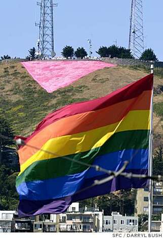 |
| Pink Triangle - Twin Peaks, San Francisco |
The best ways to use the color pink in designs would be those that are associated with femininity, love, happiness and youth. One of the most well known pink logo might be the pink ribbon for breast cancer awareness, which is indeed for a feminine purpose. T-Mobile uses a hot pink color in its logo and it is usually symbolized by a woman in a pink dress in its commercial campaigns. Elsa Schiaparelli was the first to use hot pink, which she termed 'Shocking Pink', in apparels in the 1940s.
Personally, I think that pink is a risky color to use in design for the general public because of its gender specificness in today's popular culture. It should be the last color one could use to design for conservative heterosexual men. I would also be careful when using a pink triangle unless it is intentional.
Talking about color is like dancing about architecture
“Talking about love is like dancing about architecture”
–Angelina Jolie in Playing by Heart. Trying to describe a feeling like love, is
similar to trying to describe colors, because they are something seen, not written. How does one go about
describing something like that? You’d need another language. Munsell points to
the similar problem in music, for which a language of notes was created. Things
you feel, see and hear, can be extremely difficult to describe with words and
symbols not created for that exact purpose. As someone with a mathematician’s
mind, I am in complete agreement, nay, love with Munsell’s discourse. The
manner in which he has described the color sphere has brought into blissful
clarity, a subject which, as he points out, has been a jumble of non-applicable
language terms attempting to describe something for which they were not
originally intend. Canary yellow? What if the canaries in another town are
different from my canaries?! How can I order canary yellow fabric if they have
different colored canaries!!!???
Munsell’s color sphere will be greatly beneficial to me
within my design practice because it will allow me to explain colors which
before would have been greatly subject to interpretation. By using his system
to define hue, value and chroma, one can accurately convey the three principle
characteristics of color. I consider this to be nothing short of revolutionary.
It has clarified the differences for me between value and chroma, with which I
was struggling to some extent. By imagining colors as something which can be
explained within three dimensions, I will be able to communicate with precision
that which is “not quite right” about a color. For example, if the canary
yellow fabric is in fact too dark of a shade, and I imagined something lighter
in value. Or perhaps it is too dull, and I would like something with a brighter
chroma. By using value and chroma, the hue of yellow can much more aptly be
defined.
Purple Week 2 Color Theory
Purple


The color purple has crept its way into my life.... its all over the place. When I look around me I think that it is destiny..because its all around me.
The color purple is created by a combination of red and blue hues. It is defined by any non-spectral color of violet and red. It falls on the color wheel between magenta and violet.
In our human psychology, the color is related to royalty and nobility. Originally coming from antiquity. Not only did it draw direct attention to those of great wealth and power, but it was so luxurious and expensive that only these elite were allowed to wear it. Laws even restricted the uses of this color.

The Word "purple" originates from the Greek word "porphura", then 'purpura' which is Latin, and now Old English being 'purpul'. The word 'purple' came from the Old English word 'purlpul'. The first record of the word "purple being used was 975 A.D
4th Century B.C. historian Theopompus reported "Purple for dyes fetched its weight in silver at Colophon" Tyrian purple is the actual color. (http://en.wikipedia.org/wiki/Tyrian_purple) (http://en.wikipedia.org/wiki/Purple)

Byzantine Emperor Justinian I clad in Tyrian purple, 6th-century mosaic at Basilica of San Vitale (http://en.wikipedia.org/wiki/Purple)
 The Terrocotta Army in Ancient China were decorated bye "purple"
 COMPUTER AGE:Tyrian Purples' true color is a very high chroma pigment therefore cant properly be displayed a computer
DURABILITY OF THE COLOR
This color was known to rarely fade, but its color intensified by sunlight.The color was extracted from one of manythe sea snails hypobranchial gland which is a predatory sail. The name Tyrian purple was a dye manufactured in classical antiquity. from the secreted mucus of the "Spiny dye-murex snail"

The Romans prized this color. There isnt much known for the mass productions of the dyes from the snails. But today because we are beginning to learn that when need to allow nature to replenish itself. So now the most favorable way to collect the dye is to "milk" the snails. Now, from what I know from fashion or just business period. The rariety or the time and effort it takes to produce something so precious, it indeed is expensive.
There are many flowers with this beautiful color. That it is known to also be a essential oil, that also perfume.

It has inspired pop-culture: like one of my favorite musicians:Prince. Who has been associated with the color purple. Naming his 1984 Album and Film of the same name "Purple Rain".

And in Literary works like 1983 Pulitzer Prize winner Alice Walker, novel and film "The Color Purple"
Purple is the color of good judgment. It is the color of people seeking spiritual fulfillment. It is said if you surround yourself with purple you will have peace of mind. Purple is a good color to use in meditation. Purple is also know for healing properties such as the psychy and bodys' energy associated with the "Crown Chakra"


The Amethyst, Fluorite, Sugilite,
Lepidolite, and Charoite are purply gemstones and are associated with
mysticism and purification. Also, used for meditation and sharpening of
psychic awareness, connection with higher self, and the increase of
imagination and inspiration. (http://crystal-cure.com/purple.html)
People with Purple auras are said to have a love of ritual and ceremony.(http://en.wikipedia.org/wiki/Purple)

Purple is displayed in many cultures, societies, and geography examples like Purple Mountain in Nanjing, Jiangsu Province, Peoples Republic of China. The Forbbidden City is known as the "purple forbidden city" The Holocaust: The Purple Triangle was the Nazi concentration camp badge. Militaries of the Us and UK even.
In every aspect of our lives.. my life "purple" seems to be apart of.
One day I woke up and wanted to paint my bedroom a "berries and cream" color. It is an almost pale lavendar that in the day its very light and when the sun goes down the color deepens. My bedding is an egg plant and mulberry sort of color. I didnt really plan that...
Ground Up Mummies
Mummy; a bituminous brown pigment that consisted of ground up Egyptian mummies in the 16th and 17th centuries and was sometimes sold to artists under other names to avoid the unpleasantness of knowingly painting with dead bodies. It was banned after an outbreak of disease in London was (erroneously) attributed to it.


Brown is associated with earth, nature, autumn, and all things natural or organic. More intangible qualities associated with brown include confidence, reliability, comfort, stability, tranquility, strength, productivity, and authenticity. Around the world the Hispanics and Indo-Aryan people of South Asia are sometimes called brown. More somber associations are with mourning in India, and brown was the color of the Nazi party from the 1920’s to 1940’s. In Columbia, brown is considered to discourage sales, and in Nicaragua it is a sign of disapproval (is that true, Lisette??).
A good way to use neutrals including brown in design would be in rooms designed for peace, harmony, and quiet, and in clothing that was either business conservative or 'natural' (i.e., green, organic, natural fibers) depending on the style. Where the use of brown might be discouraged is in spaces that are designed to be deliberately cheerful, upbeat and happy (i.e, the children's wing in a hospital ). There you would want to break out the oranges, reds, and yellows.
Cobalt Blue

A perfect blue. Yves Klein (1928-1962), Blue Monochrome, 1961
Blue
is arguably the most prevalent color in nature. But why do we have blue sky and
sea? It is because blue light has a shorter wavelength and is scattered around
the atmosphere and the water particles, while much
of the longer wavelength (red, orange and yellow) light pass through without being reflected.
The Blue Planet


I have been interested in the cobalt blue used in Chinese ceramics. Not only is the color one of the oldest pigment applied in history, the monochromatic designs of floral and other intricate patterns are always striking and elegant on white.
Chinese Ceramics


Ming period (1368–1644) porcelain with under
glaze cobalt blue (Jingdezhen ware)
The
cobalt blue pigment used in the ceramics is actually made using cobalt salts of alumina,
or cobalt oxide. The technique seems to have come from the
Middle East in the 9th century, notably from Iran, where cobalt blue pigments were from
local mines, and were exported as a raw material to China.
Commercial cobalt blue pigment

Cobalt blue has been used by many different cultures throughout history on artworks and painting. Blue carries a number of different meanings and symbolism. It could symbolize divine, fidelity, sadness, conserving, healing, relaxation, exploration, trust, and calmness.
Given the cultural and symbolic context, there are certain associations drawn when cobalt blue is used in design, especially in interior design, since it could affect how people feel and act in a space.
The cobalt blue color is best used when you want to convey a sense of seriousness and importance. It is quite a bold color due to its intense saturation or chroma, so it is definitely a prominent element if it is used in an interior. Given the intensity of the color, it is important to use other elements to achieve balance in the design. For example, in traditional blue and white Chinese ceramics, the cobalt blue is contrasted against the white background of the patterns, creating a harmonious balance. In interior design, a block of solid cobalt blue color best used in small accents such as tableware and upholstery. To be used on wider surfaces, the color should be used in combination of other muted hues, in patterns.
On the other hand, cobalt blue is not suitable for signage when you want to provoke the feeling of excitement, emergency, or danger, since the color might not be visible from a distance, so any signage or important communication message might be lost.
Source for research on history and origin of cobalt blue: Wikipedia
Saturday, September 8, 2012
I thought I'd share
Hello class,
Here is an interesting blog called Design Seeds. You can search for whatever color palette or one color, presentations are very inspiring. Might be helpful throughout our course.
http://design-seeds.com/
Have a good weekend!
Here is an interesting blog called Design Seeds. You can search for whatever color palette or one color, presentations are very inspiring. Might be helpful throughout our course.
http://design-seeds.com/
Have a good weekend!
Red, Carmine Red....004

cochineal slurry
Color Index 4, food color additive E120, CI 75470, "Carmine" Red...all come from one place: the blood of insects. Yep! You heard me. Essentially, to create that "true blood red" most of us consider primary red, you literally need to use blood- the blood of the cochineal insect. Don't worry, it's a parasite that feasts on the Prickly Pear cactus... if that's any consolation ... native to the warm and dry deserts of the Americas (north and south). The insects are ground up to create a sludge of Color Index Number 4, that is then processed and refined and exported to be used in paints, dyes, food color, etc. throughout the world. It was "discovered" in the early 1500s by the Conquistadors on a trip modern-day Mexico and very quickly became a commodity in Europe. Prior to this discovery, Indo-European countries were using the kermes insect's blood to create red - a much weaker concentration - a practice that had been around well before the Middle Ages. In fact, the words "kermes", "crimson" and "carmine" are all derived from the sanskrit name "krim-dja" for this insect and the blood spilled from it to create the color Red.

the cochineal beetle

a crushed cochineal beetle
It isn't unusual then that many cultures throughout the world, associate the color Red with both "life" and "death" as well as "matters of the heart" given the fact that it is created from blood. Red is love, Red is hate. Red is war and anger and power. Red is sex and luck and passion. In short, Red is a Paradox, similar to human existence. So how should and shouldn't it be used in Interior Design...?
That all depends on what you are trying to achieve or NOT achieve. Typically, most people use Red in areas of the home where they want to create "excitement" or "passion" such as bedrooms. It is also believed that painting a room Red will induce appetite and many home-stagers suggest painting kitchens or dining rooms Red. In terms of bathrooms, children's bedrooms, etc. most people stay away from Red color-schemes, as theses places are equated with more "passive" or "restful" places - locations that "Passionate" red would be unwelcome. While I agree with these notions in general, I think it all depends on the person and how much you like the color Red. If you love it, use it! If you hate it, don't!
To quote Fashion Designer Valentino regarding the use of Red ... "Red has guts .... deep, strong, dramatic. A geranium red. A Goya red ... to be used like gold for furnishing a house ... for clothes, it is strong, like black or white."
Friday, September 7, 2012
Tickled Pink
“Most remarkable children I ever saw. Which is which?...Amy
put a blue ribbon on the boy and a pink on the girl, French fashion, so you can
always tell.” (Louisa May Alcott, Little Women, Chapter 28) The
connotation that girls are associated with the color pink dates much farther
back then Louisa May Alcott’s Little Women, rather as early as the 17th
century the color pink was associated with things such as rosy cheeks, flowers,
Valentine’s Day, love, etc.; all things commonly associated with women. The 17th
century is also the first time the pigment, pink was created by mixing red and
white pigments together, (Collins Dictionary).

Louisa May Alcott’s description of the differentiation
between the twin babies is so classic to me. When I think about girls I think
pink and when I think of baby boys, I think blue. So while this may be a bit
skewed, I believe the best place to use the color pink in design is in a baby
girl’s bedroom. While the worst place to use pink is in a baby boy’s bedroom.
After all the pink ribbon is the universal symbol for breast cancer which
affects 90 percent more females than males.
Subscribe to:
Posts (Atom)